Minimalist wallpaper mural ideas: minimal, not empty
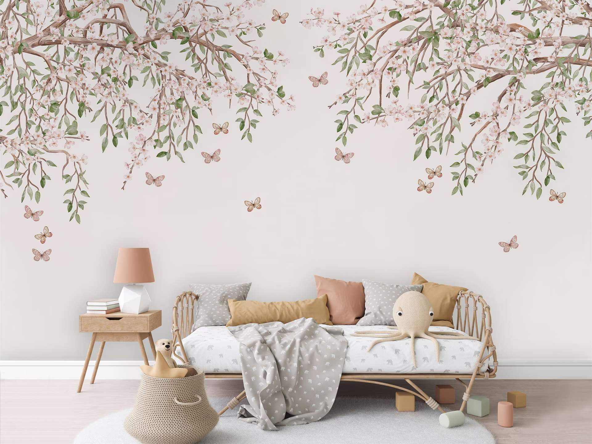
There is a particular kind of wall people mean when they say they want something minimal. Not a bare wall — they already own one of those, and it has been quietly irritating them since they moved in. What they want is a wall that feels calm. Most minimalist wallpaper mural ideas online are grids of pale product shots, which is not the same thing, so let's talk about what actually makes a wall calm rather than merely blank.
Calm is made, not subtracted. It is the result of decisions about tone, texture and space. Take those decisions away and you don't get serenity. You get a wall nobody has finished.
Minimal is not the same as empty
Kenya Hara, art director at Muji since the early 2000s, draws a line worth borrowing. Simplicity declares — it tells you plainly what a thing is. Emptiness receives. It is open on purpose, and because it is open, something can happen in it.
A blank wall is empty by neglect. A quiet wall is empty on purpose.
A blank wall is not empty in the useful sense; it is unaddressed. A wall that is empty in the good sense has been given its openness. Someone chose the tone, chose the softness of the edges, chose to let most of the surface do very little.
You can see the difference in Rotko Ash, where bands of ash grey and pale sand blur into one another with no hard edge anywhere. From the doorway it reads almost as a plain wall. Stand closer and it has a depth flat paint cannot reach. That is the trick — not less to look at, but less that demands looking.
Muted and tonal, which is not the same as beige
The fastest way to make a wall shout is to put two unrelated colours next to each other. The fastest way to quieten it is to keep everything inside one family and let the shifts happen by degrees.
Tonal does not mean colourless. Agnes Plane sets blocks of cream, sand, grey and warm brown edge to edge like a small piece of architecture — four colours, all related, none competing. The same discipline allows one deliberate break: a wall of soft taupe and grey interrupted by a single line of deep blue works precisely because it is the only interruption.
Steal that rule for the rest of the room. Restraint everywhere, then a single note of contrast. Two notes and you are negotiating; three and you are decorating.
Let texture do the work colour used to
This is where minimal walls stop being austere. Take colour out of a design and something has to carry the interest. Texture is the obvious candidate.
Ettore Line is the demonstration: flowing wood grain in pale grey and white, stripped of colour so only the drawing remains — the lightest thing in its family, and the easiest in a small room. Nothing about it is loud. It still gives the eye somewhere to rest, which a flat wall never does.
The finish matters as much as the design. Matte swallows glare, which is exactly what you want on a wall meant to recede — our Premium Vinyl is a durable, wipeable matte and the sensible default. If you want the design to look painted rather than printed, Canvas has a fine-art texture that lends murals a painterly depth. Every finish is priced openly by the square metre on the materials page, and samples are free, so you can hold each one under your own lighting first. Colour behaves differently in a north-facing bedroom than on a phone screen at midnight.
Negative space is a decision, not leftover wall
The common mistake in a minimal room is treating empty space as the bit you couldn't fill. Good quiet designs treat it as the subject.
Roerich Peaks is almost entirely negative space: pale cream and oyster ridges receding until they are barely there at the top of the wall. Close to a neutral, but a neutral with somewhere to look. Hung floor to ceiling behind a low sofa, most of what you see is the pale ground. That is the point.
Scale makes or breaks it. Squeeze a wide, open composition onto a narrow strip of wall and all that lovely emptiness gets cropped out. Every mural is printed to your measurements, so try the size before you commit — the room visualiser shows a design at true scale in a real room, which beats imagination.
Japandi, Muji and the Korean look are three different quiets
They get used interchangeably, and they are not the same.
Japandi
Japandi is the Japanese–Scandinavian hybrid, and the cross-pollination is older than the hashtag: Japanese woodblock prints reached Europe in the 1860s and have been quietly feeding European design ever since. In practice it is wabi-sabi's tolerance for imperfection meeting hygge's insistence on comfort — pale woods, matte finishes, a palette of soft white, warm beige, taupe, charcoal and muted green. On a wall it reads as grain, stone and horizon rather than pattern. Ettore Line sits comfortably here.
Muji-adjacent
The Muji register is cooler and more disciplined. Fewer materials, less warmth, closer to nothing. It suits people who genuinely like restraint, not people who like the look of restraint. A wall in this mode does almost nothing on purpose: Rotko Ash again, or the palest end of the abstracts.
The softer Korean look
The Korean interiors filling Thai feeds are lighter and gentler than either. Where Japandi grounds itself in wood and stone, the Korean look leans on soft, light shades — dusty pinks, sage greens, powder blues — with rounded forms and real attention to how a small space feels rather than how it photographs. A blurred horizon of sea green softening into cream, or a botanical drawn with an unfussy enough line to read calm at full width, both land here.
Three quiets, three different rooms. Worth knowing which one you want before you browse.
Why a quiet wall flatters your furniture
A loud wall competes. Sometimes competition is the entire idea, but know what you are signing up for. Put a high-contrast pattern behind a beautiful oak sideboard and the sideboard becomes a thing in front of the wallpaper.
A quiet wall gives your furniture a background instead of a rival. It is why a design like Agnes Plane is gentle enough to sit behind furniture without competing with it — a design brief, not a disclaimer. If you have spent real money on a chair, the wall behind it should be working for the chair.
And the honest note to end on: the wall you choose well is the one you stop noticing. Not because it disappeared, but because it stopped asking for anything. That is a strange thing to spend money on, and also the only wall you will still like in five years.
Questions we hear a lot
Won't a pale mural just look like paint?
Only in a photograph. In a real room, printed tone has gradation and grain a roller cannot produce. It is the difference between a flat surface and a surface with weather in it.
Is minimalist wallpaper a mistake in a small condo?
Usually the opposite. Busy patterns close a small room in; open, tonal designs let the eye travel and make the wall read as further away than it is. Roerich Peaks, or the paler abstracts, will do more for a small space than a bold repeat.
Can a botanical design still count as minimal?
Yes, if the drawing is calm and the palette is tight. Restraint is about how a design behaves, not what it depicts — the quieter end of the botanical range makes the point.
How do I know if I have gone too quiet?
Stand in the doorway and look at the wall for ten seconds. If you feel nothing at all, it is too quiet. If you feel slightly settled and can't quite say why, that is the one.
If a room in your home has been waiting for something better than blank, take a look at the calmer abstracts, then see your favourite on your own wall at true scale before you decide anything. The wall has been patient this long.