Wallpaper mural scale in a small condo room: how big is too big?
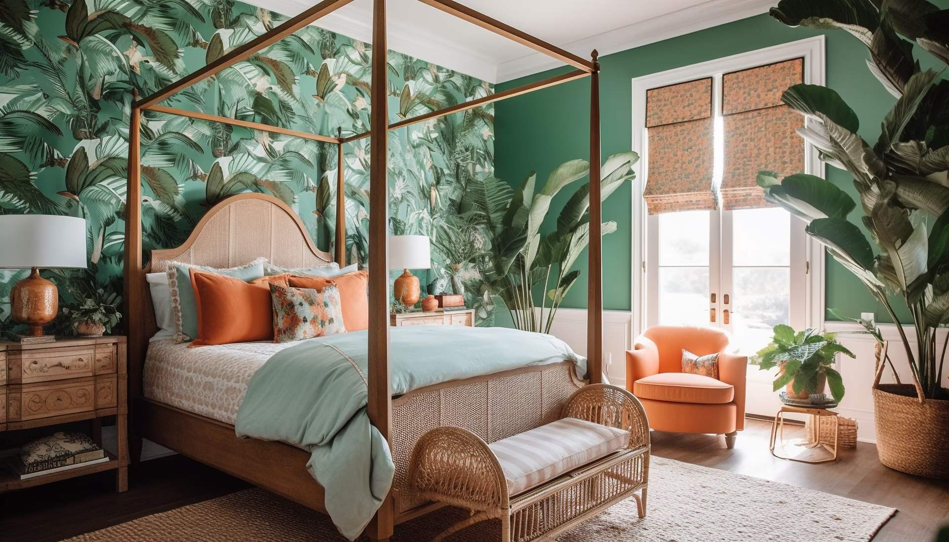
Here is the question that stops people mid-scroll. My condo bedroom is small — will a big mural make it feel smaller? It is a fair worry, and the honest answer runs the other way. Choosing mural scale for a small condo room is not about shrinking the design until it is polite. It is about giving one image enough room to breathe. The thing that closes a small room in is rarely a large picture. It is a small, busy, repeating one. So let's talk about scale.
First, work out which wall has earned it
Four walls, one mural. The wall that wins is almost always the one behind the bed, or behind the sofa.
Two reasons, and the second is the interesting one. First, it is usually the longest uninterrupted stretch you own — no door swing, no window, no aircon unit at an awkward height. A design needs a clean run to read as a composition rather than as offcuts.
Second: you do not look at the wall you are sitting against. In bed it is behind you. On the sofa it is over your shoulder. That sounds like a waste of a good wall, and it is the opposite. A bold design you face from a metre away every evening is one you stop seeing by Thursday and start resenting by spring. Put it behind you and it becomes the room's atmosphere rather than its television — seen as you come in, in the mirror, in glimpses. The right dose.
Avoid the window wall, which is backlit and will flatten any image you put on it, and the one carved up by wardrobe doors.
The counter-intuitive bit: big and calm, not small and busy
Instinct says: small room, small pattern. It sounds sensible and it is usually wrong.
A tight, dense repeat on a small wall gives your eye dozens of stopping points. It reads as noise — lots of little things very close by, which is precisely the feeling of a cramped room. Add the motifs chopped in half at the corners and you have a wall that fidgets.
A large, quiet design does the reverse. Fewer edges, longer distances between them, space for the eye to travel. Movement reads as room. It is why a big misty landscape can make a small bedroom feel like it has somewhere to go, while a small floral in the same spot makes it a well-decorated cupboard.
The word doing the work is quiet. Big and loud really is too much in a small room. Big and calm is the sweet spot: low contrast, one thing happening, not fifteen. Roerich Hills, where ranges of hills fold back into mist, does not shout. It simply implies the wall is further away than it is.
A large design gives your eye distance to cover. A small busy one gives it a crowd.
Scale is a relationship, not a size
A pattern has no scale on its own. It only has a scale relative to the wall it lands on.
Picture a design with a generous repeat. On a five-metre living room wall it repeats three or four times and the eye reads a rhythm: pleasant, architectural, deliberate. Put it on a three-metre bedroom wall and you get one and a bit. Not a rhythm — an accident. That half motif in the corner is the bit you will notice for the rest of your life.
This is the real reason large-scale wallpaper gets a bad name in small rooms. Not that the motifs are too big, but that the wall was never long enough to finish the thought.
Why a made-to-measure mural behaves differently
Roll wallpaper has its scale decided in a factory, long before it meets your wall. Your wall then decides only where it gets cut. That is the whole problem in one sentence.
A mural is a single image printed to your measurements. You enter your wall width and height in centimetres and the composition is sized to that wall — same picture, scaled to you, with the bleed and the panel maths handled before it goes to print. The full process is in how it works.
So the relationship between design and wall stays fixed however small the wall is. A horizon a third of the way up stays a third of the way up. Nothing lands badly, because there is nothing to land — it was made for this wall and no other. In a small room, where every awkward crop is at close range, that is most of the reason the thing looks intentional.
Proportion still matters, mind. A wide, low composition wants a wide wall; a tall narrow one wants vertical lift. Match design shape to wall shape.
Depth, and where the horizon should sit
Small rooms respond extraordinarily well to a horizon line, which is the closest thing interiors have to a magic trick.
Anything with distance in it — mist, receding hills, water meeting sky — borrows depth the room does not physically have. Cool tones retreat, warm tones advance, soft edges read as far away, and your eye accepts the invitation without asking questions.
Where the line sits matters more than people think. A horizon roughly at seated eye level feels natural; set it too high and the wall leans in on you. Rotko Dawn — warm sand above a dark earth band, like a horizon just before the light arrives — is quiet enough to sleep in front of and still does the trick. The landscape designs work the same way, at varying degrees of drama.
Floor to ceiling, or stop short?
Floor to ceiling gives the room its full height back. The wall reads as architecture rather than a large picture hung on paint, with no horizontal line halfway up telling your eye where the room ends. In a condo, where height is usually the dimension you have least of, that uninterrupted run is worth having.
Stopping short is the gentler option. Ending at headboard height, or where a picture rail would sit, turns the mural into a framed moment — less commitment, and easier to live with if the design is a strong one.
Two things to watch. If the ceiling is low, a heavily horizontal design taken floor to ceiling can press the room down further; something with vertical lift serves you better. And never stop the mural exactly where the headboard starts — go behind it, or leave a clear margin above. A design half-swallowed by furniture looks like a mistake even when it isn't.
A botanical like Emil's Garden, broad leaves drawn in a steady, unfussy line, reads as calm rather than busy even at full width. That is the test: does it stay calm at the size you need it.
Questions people actually ask
Will a large mural make my small bedroom feel smaller?
Not if it is calm. Large and quiet opens a room up; small, dense and high-contrast closes it in. Judge the busyness, not the size.
One wall, or all four?
One. A single feature wall with plain, quiet paint around it gives the mural something to be measured against, and that contrast is where the sense of depth comes from. Wrap all four and you lose the reference point.
How do I know it will look right before I commit?
Try it at true scale. Put your wall size into the room visualiser, pick a design, and it is drawn into a photographed room at the correct proportions rather than squashed into a swatch. It settles the argument you have been having with yourself all week.
What if my wall is shorter than the design looks online?
That is exactly what made to measure solves: the image is scaled to your wall, so the proportions in the visualiser are the proportions you get. Pricing works the same way, per square metre from your own measurements — the live rate for each finish sits on the materials page.
Small rooms are not the problem people think. They are where one good decision does the most visible work, because there is nowhere for it to hide.
So measure the wall behind your bed, pick something quiet with distance in it, and see it on your wall at the size it would actually be. The wall has been beige for long enough.